beyond the bottle
Our visual identity draws inspiration from the world of art and design, with an aura that would celebrate the uniqueness, curiosity, and daring imagination that sets Noble Rebel apart from tradition.
Every element of our world has been carefully crafted to reflect our core values of innovation, creativity, and excellence. Flavour is hugely important to us, and our bold colour palette is inspired by the flavour found within our three core releases.
From our sleek packaging design to the carefully chosen details, everything has been thoughtfully considered to create a cohesive look and feel from first sight to first sip. Combining the nobility of single malts, with the rigour of craftsmanship, blending, and the beauty of creativity, each bottle has a unique story to tell.
We invite you to experience the difference for yourself and discover the unforgettable flavours of our releases.
Hazelnut Harmony
Using a soft, warm colour palette with natural tones, the design combines flowers, fruits, nuts, nature and wildlife. Blending organic ellegance and highlighting the nature element of the whisky.
The hot air balloon adds a whimsical touch, creating a dreamlike representation of organic beauty and harmony.
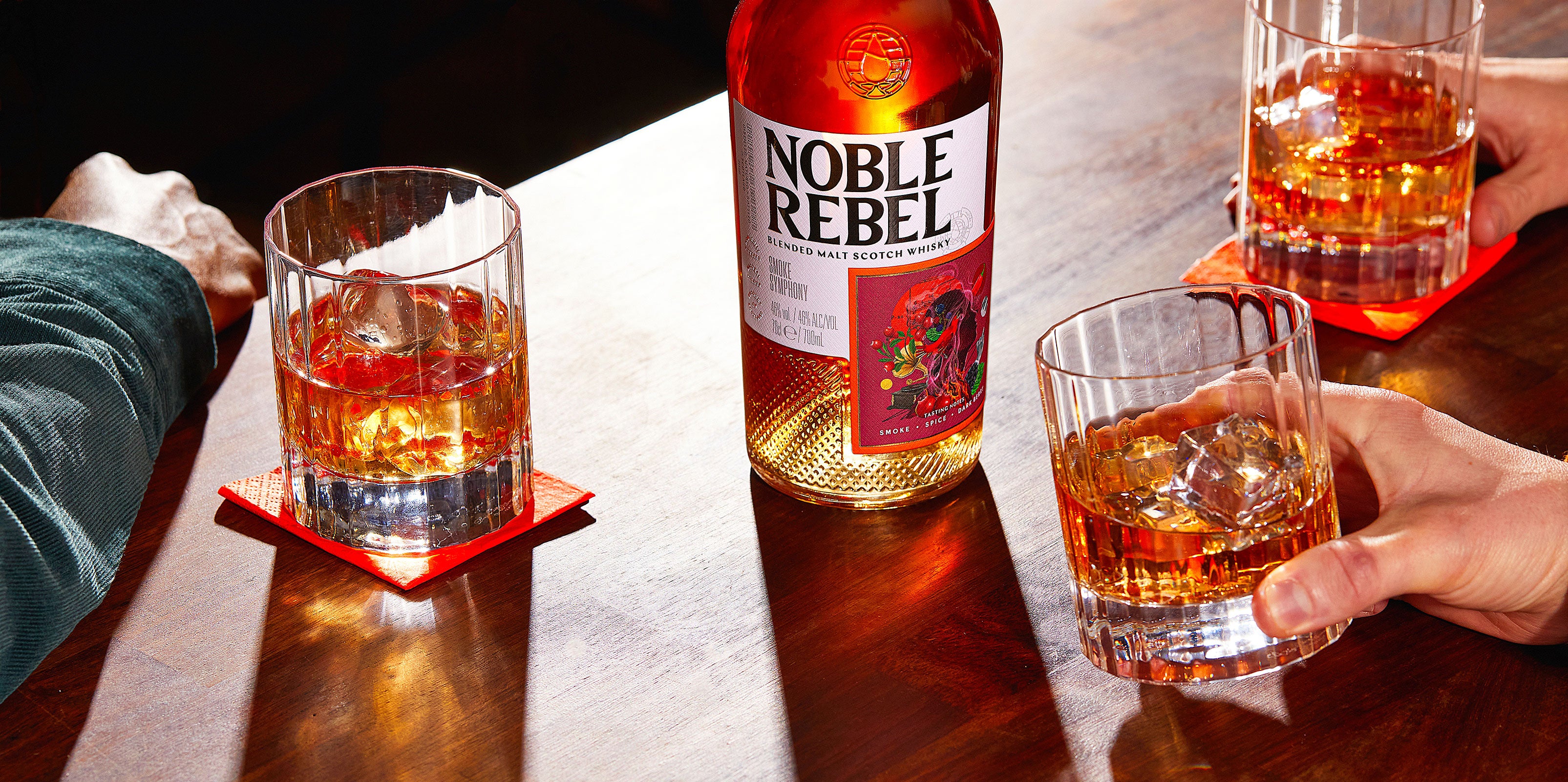
Shop NowSmoke Symphony
This artwork combines music, nature, and fire to create a dynamic, dramatic visual that evokes creativity, passion, and intensity. This is symbolic of the passionate craft in creating this whisky, and the warmth found in the flavour.
Shop NowOrchard Outburst
Citrus and orchard fruits such as apple, pear and peach are met with a vanilla orchid and delicate pink blossoms. This is symbolic of the key flavours in the whisky.
Crashing ocean waves add a dynamic, refreshing element, emphasising fluidity and the balance of subtle saltiness.
Shop Now

